pushed
subh05sus/sparkmentor • 9:56 PM - Aug 20, 2026
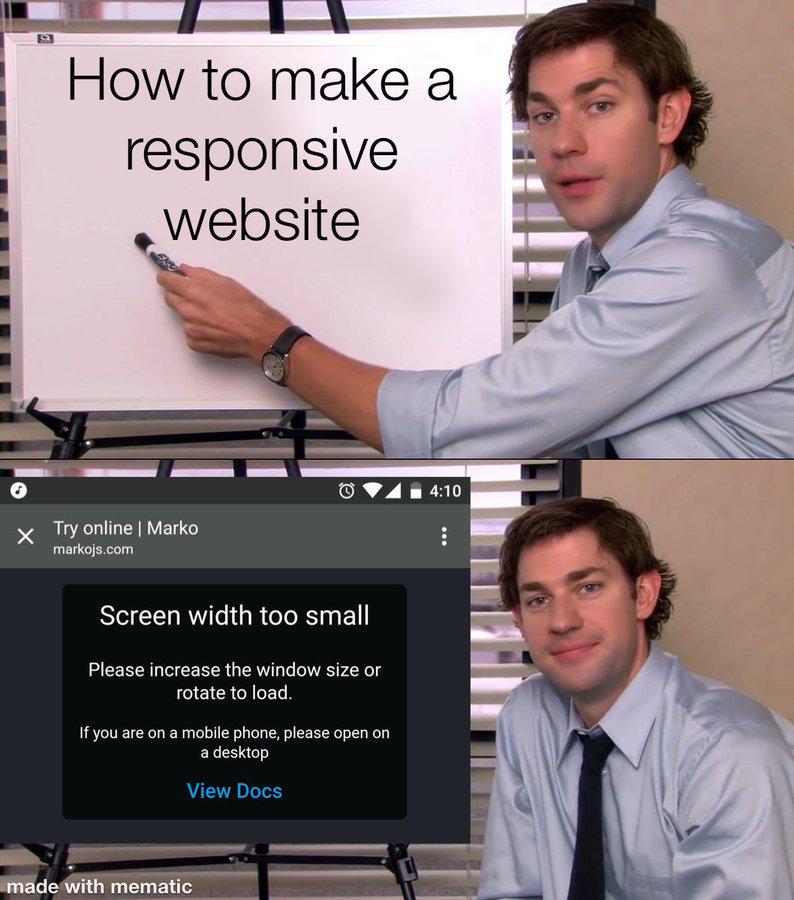
We have completed a comprehensive responsive UI pass, moving from a desktop-centric header to a native-feel mobile experience. Key updates include the transition to tab-based navigation with a 'More' drawer for secondary routes, the implementation of iOS-style large title headers that collapse on scroll, and a shift to card-based layouts for complex data tables on mobile devices. We also established mobile foundations like CSS safe-area handling, viewport height optimizations, and the removal of browser-default behaviors like tap highlights to ensure a professional, app-like feel.