
landingpage

We've overhauled the landing page for our financial signal agents, focusing on a cleaner, punchier layout and improved readability. This update includes a switch to JetBrains Mono, better mobile-responsive typography, and a refined IA that prioritizes clear, action-oriented copy over clutter. We also improved the scroll-reveal performance and increased touch targets to exceed 48px, ensuring a snappier, more accessible user experience.
The CSS for primary buttons was updated to set the border color to solid black, improving visual consistency and contrast across the interface.
Updated src/style.css to unify the border appearance across the cards and steps components. This ensures more visual consistency in the UI layout by aligning the border definitions.
I've updated the FAQ section in index.html to provide clearer information for potential users. We've refined the language to better clarify the unique value proposition of Lattice compared to other available tools.
We've restructured the project to use Vite as our build tool, replacing the previous configuration to improve dev server startup times and hot module replacement. This migration simplifies our build pipeline and provides a more modern development experience. Expect a significantly snappier feedback loop during local development. 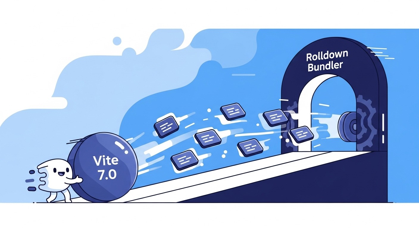
Implemented a fresh, minimal landing page for Lattice, the AI Chief of Staff. The page outlines the value proposition for coaches looking to automate operations, details how the service works, and provides a clear CTA for applicants to apply for access.